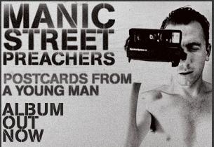
 Manic Street Preachers are an alternative rock band, which is the genre I would like to do for my music video. This advert has been put to a landscape setting and shows Manic Street Preachers advertising their new album, which is their 10th studio album produced. This is shown by the medium sized font, of which is similar to the band names font, saying ‘ALBUM OUT NOW’. This is positioned in the bottom right corner of the advert, with each word one below the previous, and is in a dark grey shade of colour. The rest of the text matches this same text style, however, the text which reads ‘POSTCARDS FROM A YOUNG MAN’, which is the name of the album, is in a slightly smaller font size than the previously mentioned text. This may be because it is of less importance and does not have to be read by the viewer first and therefore does not stand out more than the other text. The font colour of this text is also different from the previously mentioned, as it goes from a light shade of grey through to a darker shade of grey from the first word ‘postcards’ to the last. This text is left aligned and is positioned in the middle of the advert. The main text on the advert is for the band name ‘Manic Street Preachers’, which is in a bolder black colour, however, it is still in the same font which makes the advert look continuous. The size of the text reflects the importance, as it goes from the largest text ‘MANIC’ and gradually decends into a medium sized font ‘PREACHERS’ – the same size as the ‘ALBUM OUT NOW’ text. The band name is positioned in the top left corner so that the viewers can see this first, and recongise the band they may like.
The image on this advert covers the whole size of it, however, the subject is positioned on the right and takes up just less than half the advert. The image is of a young man (which links to the text) holding a Polaroid camera which covers half of his face, he is also squinting with the other eye, which could suggest he wants to hide his face and to be only able to see through a camera lens; a distored view and also often referred to as the ‘perfect’ view, as you cant see the underlying feelings or effects. The image is in black and white which reflects what the polaroid camera that the subject in the image is using would produce.
The advert as a whole is really simplisitic yet really effective as the contrast of the two colours – black and white – makes cetrain features of the advert stand out. The idea of using light and dark to cause different effects such as highlighting and shadowing features also does this.
 This is what the advert is advertising- the actual CD album. As you can see, the album cover uses the same text styles and image, however, there are alterations. For example, the image shows a medium close up of the male subject, whereas on the advert it is slightly more zoomed in so that you can only see the top half of his upper body. It also leaves part of his left shoulder out as it is positioned to the right side of the advert, which contrasts with the cover, as the image is central. By having the simularities between the two, you can see they link, and therefore you recongise that the advert matches the album and vise versa.
2. The Courteeners Advert Analysis
 The Courteeners are an indie rock band, which is in the same kind of genre of music which I would like to do for my music video. This advert is advertising a new album from the band, which is called Falcon. This relates to the image which is of a Falcon bird and covers both of the two pages of the double page spread advert. The bird is a one of prey and is known to be skilful and strong, which is exactly what the image reflects as the coverage of two pages shows the dominant nature of the bird. The left page of the advert see’s only the blurred markings of the bird, which have been created in some kind of Photoshop software to construct the effect of the fast movement and momentum of the bird. This contrasts to the mostly clear image on the right page, which sees the Falcons head, claws and wings – which merge into the blurred effect and gives the appearance of flight.
The image fills up most of the pages; however, there is still space on the black background to fit informational text. The left page shows most of the information on the advert, such as what it is advertising – a new album, the release date and the name of the new album; these are all in the same style and size of font. The font colour is white, which means it stands out against the black background, and the medium sized font reflects its importance to the advert. This information is positioned in the bottom left corner of the advert, and under this is more detailed information. Again, the font appears to be the same style; however, the text size is smaller as the information is of less importance. The three separate lines, which are positioned one under another detail the album contents, and also give the bands website address, encase the viewer wants any more information on either the band or the new album. Next to the middle section, on the black background and below the subject in the image, there is ‘PLAY.COM’ logo, which advertises their website, but also links to the fact that you can download the album from that website. On the right side of the page, the band name is singled out so that it stands out on the one page, especially with the significance of the clear image on that page. The text style of this is clearer, with a rounded font, yet it is still white, with the contrast of the black background. The text is also slightly larger than others on the advert. The positioning of this text, which reads ‘The Courteeners’, is near the bottom of the page, however the image and this bit of text interlink as it has the affect of looking like the predator bird is drawing down with its claws on the text of the band name – the prey. This again draws the attention to both the band name and the bird image.
The colours used in this image are mostly different shades of blacks, greys and whites, and along with the plain background and text it, draws the attention to the silvery result of the birds existence, and intensifies the fact that the Falcon is a predator, and on the hunt!
This advert works well as the effects used on the image draws the attention of the potential target audience. This also then allows them to see the information on the advert, as they are all on the one page. The clear and focused presence of the page on the right also attracts the audience as it’s easy to see and read the text. This shows that the advert works well, especially with the two pages complementing each other.
3. Jamie T Advert Analysis
 Jamie T shows a rare combination of genres through his music such as alternative rap, indie rock and post-punk revival. This colourful and inspiring originality reflects in the advert which is advertising the artists’ new album. The advert appears to be split into two sections; one on the left, and one on the right. The left hand side of the advert is composed of writing and reviews. The artists’ name, Jamie T, is in the largest font and is positioned in the top left corner. The font colour is blue, which could represent the masculine the side of the artist and the stereotypical link of the colour of blue and the male gender. Directly underneath the artists’ name, is the name of the album, ‘Kings & Queens’ and the sign ‘Out Now’; these are in pastel shades of colours – orange and yellow, just like the blue shade for the artists name. The medium sized text fits in perfectly in the width of the text above it. Below this information there are many reviews from different magazines and newspapers. You can see this by the small sized font, which are in various different pastel colours such as greens, pinks, blues and oranges. Each name has a number of stars next to it to show what rating out of five they give. For example, MOJO, which is a popular music magazine, is coloured in a pastel pink colour and has four stars next to the text- this shows they have rated the album 4/5. All of the reviews are centred, within that section of the advert, and give at least a four star rating, which shows the excellent response that many top selling magazines and newspapers have given. This information intrigues and interests the viewers into buying the new album, and is therefore a good advert.
The right hand side and section of the advert shows a circular image, with writing following the curved edge of the image. The writing reads ‘Jamie T Kings & Queens’ which is then continuously repeated around the circle edge. The text font size is small and the colours match the rest of the advert by being pastel shades. There is a small space left between the image and the writing, however the border of the round image has a white blurred effect, which stops the edges being blunt. There is also a grey coloured blurred style effect which covers parts of the circle outside of the writing. This again stops the bluntness, and also adds an original approach and quirkiness to the advert. This reflects the style of Jamie T and his music. The actual image shows two people with the background seemingly being the typical New York apartment. One of the subjects in the image is standing centre aligned and near the bottom of the image; we can see the soles of the subjects’ feet and the angle of the image is high, as the low and almost worms point of view gives the impression that you are under the earth which is the grounds view looking out at the rest of the world. The effect this gives is really strong and could reflect the outlook of the artist. The image also looks as though it has been taken with a fish eye lens and it gives the impression of looking through a glass- the distorted view. The rebellious attitude of the main subject in the image also reflects the style of music that Jamie T producing, and the attitude he wants to illustrate.
The advert as a whole is really appealing by the colourful nature used in the text and the originality of the image. This will appeal to the target audience, especially as there are many positive reviews.
Conclusion
From this research I have found that I really like the idea of a combination of genres, and think it would be very interesting - I may like to use this style of music in my own music video, so that I wouldn’t have to conform to any specific codes and conventions of a certain genre of music. I also like the design and thought behind the Manic Street Preachers advert, as the image links in with the final advert view because of the simplistic black and white colours, and the Polaroid camera. I would like to use the technique used in the image for the Jamie T advert, as I feel this reflects a certain attitude which I like. I also like how the image is cut out into a circle shape, as it subverts the conventions of a typical advert. All of these adverts will suit their target audiences as they are all generally appealing, either by the effects used or the gripping text.
No comments:
Post a Comment