Wednesday, 10 November 2010
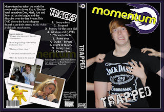
Rough Cut of DVD Cover

Rough Cut Of Advert
Tuesday, 9 November 2010
Developement of DVD Cover
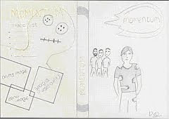 This is the plan for the DVD cover for Momentum, our concept for the cover involves the lead singer being grabbed by many female hands, we will have many females holding on to his body and I will then Photoshop the girl’s bodies out of the image to leave an array of female hands holding on to his body. We will try to co-ordinate, Dan, the lead singers outfit so it matches with the Momentum logo. As the logo features the colour purple, we will style Dan wearing a purple t-shirt, this will then be consistent. We will have the band in the background as I think it’s important to incorporate the whole band into the cover. The spine will be mainly influenced by Momentums logo, as when the DVD is on a shelf we would want it to be recognisable by just the spine. The spine will consist of the bands name in the style of the logo and also a slight image of the circled shape of the logo we think that this will make the spine stand out. For the back of the DVD cover we think it would a waste not to use the voodoo doll in the cover, we think this because as the voodoo doll is Momentums motif, its very recognisable so I’m planning designing the back of the DVD cover so the image of the Voodoo is the background, I will make the image very opaque so its not too obvious and also by making the image op
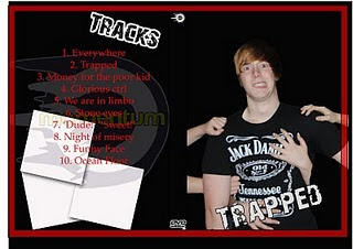 aque, it will lighten the bright yellow colour making it less dazzling and it will also allow the other images to be seen. Also on the black of the cover we will include the bands name at the top, the name will again be in the style of the logo to make it consistent. We will also include some images from the footage of the music video. We will have 3 images, one of the band, one of an instrument and another of the psycho ex-girlfriend (Georgia) who features in our music video. The images will be presented in a colour box format which will incorporate some colour into the cover. A track list will also be included on the back of the DVD cover.
Tuesday, 2 November 2010
Rough Cut Feedback
''This was an immensely enjoyable video and can be transformed into an excellent project. The narrative is very strong and Georgia's performance is magnificent. Abi’s performance is good too. The male lead is inconsistent in performance in the narrative and lacking power and charisma in the band footage. Remember, it is a magnificent performance of YOUR narrative, so the credit needs to go to you for producing the narrative. I do think most of it needs re-shooting, but you are able to re-shoot from a perspective of knowing that the video works, which is a good position.
General issues:
Lots of the footage is very dark
Lip synching is out
The violin footage jars with the overall video - perhaps this could be re-done with the band footage and the focus just on the violin, not the violinist.
The performance of the stabbing is a bit ropey.
The lead singer needs to be more dynamic.
It needs chorus shots with lots of energy.
I would have the cheeky wave on the last shot, before she becomes genuinely menacing and psychotic in the flick of a switch.
She needs to slap him harder. Could you use some diegetic sound for the slap?
How do you film a slap scene?
He needs to kick Abi harder.
When she has been dumped, but before she gets the doll she should "totally do one". She needs to be mental/devastated here. I want to think that suicide, crying and violence are all possible, before she settles on the doll.
The band need to be more dynamic.
DRUMS Drum shots on the drum solos. More band footage, but don't take too much of the narrative away because it is fabulous.
Get the brother out - I had to explain it to people who assumed it was just the protagonist.
Specific shots:
The walk on is nice but possibly a little slow. Remember the band are representing their whole brand image in the opening shots, yet we don't see their faces.
In the passage scene there is a banner on the door - this is distracting
The bedroom door is not the best
Why is Abi wearing that jumper on a date? Would he really ditch a girl who dresses as a nurse for one in that jumper?
Georgia too long outside the pub.
The wardrobe scene in edited quite awkwardly.
I like the head spin, but perhaps it needs to happen on the "Everywhere..." line to match the increased tempo of the song.
When he falls, which I love, it takes him a very long time (and shot more importantly) to get up.
Why does he have a T-shirt under his pre-surgery material?
Why is he about to open a wardrobe when he has just been in the pub?
On the first zoom on the doll you nearly miss the actual doll.
Suggested re-shooting:
Re-shoot the hospital scenes out of school.
Why does he look at the walls when the hood is removed? I would look at the person who took it off. Where was this scene filmed?
What is the time on the kitchen clocks?
More footage of the doll - it's really creepy.
Get a new barmaid.''
This is the feedback we received from our rough cut, we have thoroughly observed and taken in the feedback as we think that by considering suggestions of improvements to our video we can improve it and hopefully identify and complete changes that our target audience would enjoy and like.
It came to our attention that when we completed feedback, it was clearly pointed out to us that the slap scene at the start of the video, was too dark and more camera angles were needed to catch the mood and feeling of this key moment in the video. We took advice given in our feedback to re-shoot this scene using more and brighter lights and we also decided use two cameras’ to get more angles on the slap scene.
Through doing feedback, the feedback showed us that although our narrative is strong, our band performance lacks ‘charisma’ and ‘enthusiasm’ will have decided to improve this critiques made so we decided to offer our lead male techniques to improve his confidence. We think that this will improve the bands overall performance. We will also change the location of the band footage, by swapping a black studio for a small recording studio we think that it will add more character to the band footage and therefore create more charisma.
We were told that the violin footage didn’t relate as well as we’d hoped to the rest of the video so rather than incorporating a violin into the initial band we decided to cut the violin out as we didn’t think it would fit into a rock-pop band.
Thursday, 21 October 2010
Rough Cut Video
In this post you will find our Rough Cut video; by watching this you will see the links from our animatic and audience research, for example, the bed scene where the ex-girlfriend crawls up the bed - this was similar to our animatic video. We showed a group of people, who were our target audience (aged 16 upwards) meaning teenagers and young adults our rough cut video. They then returned feedback, which we used to help us improve our music video, to make it better suited to our target audience.
(We had to remove the song from the video to be able to post this on Blogger because of copyright reasons)
Wednesday, 20 October 2010
On Set Photos and Footage
Storyboard and Animatic Feedback
Animatic
The animatic was put together by placing the storyboards in order on Premier Elements. The song was then added so we could then change the length of each storyboard image and how long they lasted for e.g. one second or five second depending how long the audience need to see it. This means we will have a more clear idea on how long each shot should last when filming and editing, therefore letting us know how much more filming, narrative or band we would need. The animatic as a whole let us see what the music video might look like as the images go in time with the music and therefore show some of the editing techniques we may use. Due to this we got more of a sense of timing and speed as some shots were too long and this would bore the audience, although if they are too quick this would confuse the audience. As a result changing shots by using different storyboard images was key.
(We had to remove the song to be able to post this on the blog for copyright reasons)
Tuesday, 19 October 2010
Storyboards - Narrative + Band
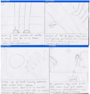
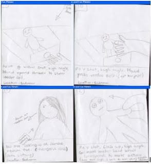
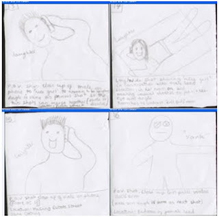
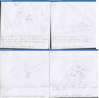
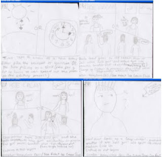
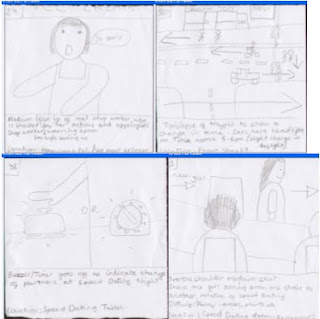
Below you can see the storyboards that we designed and used throughout the whole filming process, however, when we use the storyboards we may change our minds upon the situation of the scenes or the costumes worn by the actors etc. We stuck the storyboards to A3 bits of paper, and then laminated them so that we could take them to our filming shoots and they would not get ruined. When the storyboards were laminated we kept the narrative and band separate so that we weren’t going through all the sheets to find band yet they were still in order so the layout of the story wasn’t changed, it just made it easier to organise shooting. Therefore these were vital as it allowed us to discuss new ideas with each other while looking at our storyboard, filming and directoring. (As shown on bottom picture)By using the storyboards, it will help us while filming as it will support us with the organisation of shots, locations, Mise-en-scene and the protagonists needed for the scene. For example we know that when we film the falling scene that we need a phone as a prop and to do a range of close up and long shots to show the characters face and fall.
Narrative:
Codes and Conventions
After watching through various different pop punk music videos, codes that are used in the videos would be that the camera
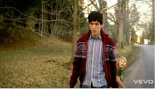 always uses a mid shot of the main artist, whilst performing, to show the audience who the main singer is, and who is providing the most powerful lyrics. Mostly the video is about the narrative/concept trying to be portrayed, usually this has a serious meaning, for example fall out boy’s – sugar were going down shows the hypocrisy of society by trying to show this though a light hearted way. http://www.youtube.com/watch?v=uhG-vLZrb-g
Usually if the speed of the song is sped up the editing and scenes of the video become faster to fit the pace of the video to fit in with the songs pace. Usually a punk pop video starts with a medium/slow
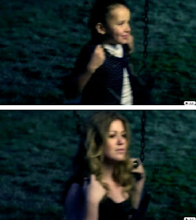 -paced mood, with the chorus becoming faster as the lyrics talk about the main message of the song. For example, in Kelly Clarksons video ‘my life would suck without you’ within this video, the edits/scenes start off slow, with a bit of background knowledge, then as the song becomes more fast paced, the cuts become faster and faster.
http://www.youtube.com/watch?v=WJedoEM7G5U
General observations from all punk pop videos show that the main costume/dress worn by the bands are usually darker colours for example; black, grey, red, blue. The usual clothing types are a casual t-shirt, with jeans and trainers, which suit the genre; in this case you could say the brands vans or converse. However the main singer of the band usually wears a lighter colour, this is used to make him/her stand out to the audience, again to represent that he/she is the most powerful. The use of clothing in the music video also reflect the mood of the song, so for example, if the song was about a relationship break up, the colours would be darker to represe
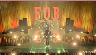 nt the melochany tone within the lyrics that is trying to be portrayed. Clothing would then be shown as for example; a hoody and darker coloured jeans, again trying to portray the depression within the song. When the band is playing their name is usually seen somewhere on the screen on that time also, usually either on the drum or behind the band, this is used to make the viewer subconsciously remember who the band is, and entice them into buying into the bands brand image. This can be seen in Fall Out Boy’s ‘thnks fr th mmrs’. http://www.youtube.com/watch?v=onzL0EM1pKY
Lighting within the video highly depends on what the video is trying to portray, again for example a break up, then the lighting would be darker, to represent the depressing tone within the video, as the narrative develops, the lighting would change, varying on what was happening with
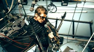 in the frame, if the band was performing the lighting will be focused on the band, with the lead vocalist being in the spot light, with the rest of the band positioned behind the lead, also being in light, but not spot lights. The props obviously if the band is performing will be their instruments, and then also anything else, for example the background – depending on what the background and foreground is it would vary. For example an arena, the background would possibly show some wiring that connect to the lights etc, where as the foreground would just be the microphones and stands and possibly any stands they may be on. http://www.youtube.com/watch?v=R8OOWcsFj0U
For example, in Muse’s ‘undisclosed desires’ the foreground does not vary greatly, and where as the background does, this contradicts the usual codes and conventions of a music video.
From the research we have gathered from this, we will be able to use these codes and conventions to our advantage in our music video. For example, when the song speeds up we will be able to make much quicker paced edits, to relate to the ‘craziness’ of the song.
Sunday, 17 October 2010
Voodoo Developement
In this post, you can see the designs we used and developed into the final voodoo doll, which we used within our video. As this was a key prop and it was going to be seen throughout the video it was a vital that it looked right. By using out mood board which had voodoo doll images on, we found out that the eyes were usually either buttons, dots or crosses; as a result we experimented with features like this. Also we added extra features like stitches and hearts; this made it easier to act out certain scenes in the video, such as the stabbing scene.
Friday, 15 October 2010
Target Audience 2
Thursday, 14 October 2010
Target Audience
This video shows how we have interviewed our target audience about a number of different subjects, for example storyboard feedback, animatic feedback
Narrative Theory
Planning Timetable
 We will use these throughout the project as a guide as to what we will be doing in lessons, and also for homework and out of school activities. The timetables will help us plan out our filming slots and keep us organised.
(If you cannot see the images, please click on them to view as a seperate image on internet explorer and click again to enlarge to see clearly)


Monday, 11 October 2010
List of Props, Locations, Lighting Plans and Costumes
Props
We will prominently be using the voodoo doll as the main prop within the music video, and throughout the many scenes and scenarios. This is because it is the motif in our narrative, and will help the viewers understand the theory behind both band and narrative scenarios. However, there will be other props that will help us to tell the story. Other props we will use include the band instruments (bass guitar, electric guitar, drum kit with sticks, microphone and microphone stand) which will only feature in the band footage. There will also be a mobile phone which will be used when the male protagonist falls over in the street. It will be used to introduce the second female character in the video, as she will be the one speaking to the male on the other end of the line. There will be a few props being used in the scene at the pub location; these include a tissue for when the new girlfriend gets upset over a spilt drink- the prop of a tissue will make the sadness realistic. In the pub scene there will also be the glasses full of drink which will be taken from the bar to the seating area. These props are used both for the purpose of the spilling scene and to make the reason for going to the pub more apparent. Another prop that will be used in the music video will be a packet of chicken dippers (!) which will be used in the freezer cam section in the kitchen location scenes. The TV and TV remote will also be props that will be used in the shots where the male protagonist sees the crazy ex-girlfriend on the TV screen. Photographs that will be attached to the wardrobe in the evil ex-girlfriends room (and will be ripped down) will be props used to help sell the angry act of the ex-girlfriend and the fact that the male and female protagonists were together in relationship as the photographs will represent memories. We will also use a clock in a time lapse, and therefore will be a prop to our music video. There will be a car scene in the video; consequently the car can be seen as a prop.
All the previously mentioned props will help the viewers understand our narrative easier once the music video has been made as the props can be used an another form of speech, or another way to express a certain emotion, or even to show the viewers of a journey.
Locations
There will be many different scenes and scenarios within the music video, as the narrative will follow the male protagonist’s life over a series of days following a break up. These locations will include a passage way in a house that is meant to be the evil ex-girlfriends. This is where we will introduce the two leading characters who have previously had a relationship, but are now arguing. We will then see the male protagonist leave the house and walk down an estate street - the next location that is seen. We will then see the ex-girlfriend in the house location, both on the staircase and in her supposedly bedroom as these cuts will all link. Another location in the video will be the pub, in which two scenes will be filmed; one at the bar (both behind the bar as a worker and in front as a customer) of the pub, and one in the seating area. When we introduce a new female character into the videos, we will also be introducing a new location - the females’ bedroom, which will be used to contrast to the evil ex-girlfriends. A car park in the
These locations will be used to help the viewers understand the progression of the males ‘mental health’ (as it goes from a friendly estate street to the strange hospital) and also the evilness of the ex-girlfriend as she is situated in every location – linking with the lyrics ‘everywhere’.
Costumes
The costumes we will use for the music video will mostly be casual wear for the many ‘day scenes’; this can include casual jeans, print t-shirts and jip jackets for the male protagonist, and leggings/jeans, and a top with a cardigan or small jacket over for the female actors. For the scenes in the pub, clothing such as a smart shirt and jeans will be worn by the male actor and a nice top with jeans and heels will be worn by the female. We will dress the ex-girlfriend in a black hooded jacket for certain scenes, so that when an event happens to the lead male, he will look around and think he sees the ex-girlfriend, however after looking again she will not be there. By having the ex-girlfriend in the hooded jacket, it will make the uncertainty of the male clearer for the audience to see, as the costume would make it harder to distinguish if it really is the ex-girlfriend or not.
However, we will also use costumes such as patient’s outfits and lab coats to fit in with the narrative of the deteriorating mental health of the male character. The male protagonist will wear a patient’s gown whilst filming the hospital scenes to further the fact that he is actually in a hospital. Lab coats will also be used so that the ‘doctors’ have the authorial look, in which they would need for that particular scene. The ex-girlfriend will also wear a nurse outfit to further the mis-en-scene.
For the band scenes, the lead vocalist, who is also the lead male in the narrative, will be wearing the patients gown again, and the other band members will wear the lab coats to fit into the theme of the story.
Lighting Plans
We will try to use as much natural light as possible so that the end result looks like it is in realistic and natural lighting. In locations where it will be too dark, we will use the industrial site lights to ensure the video image can be seen clearly, and the lights make the scene look like natural daylight. However the lights may cause shadows and so we will have to learn how to use them properly before filming to ensure the finishing product will look good.
Tuesday, 5 October 2010
Initial Roles Developed
Rachael – through the planning stages, will crop and start off the animatic whilst Sherry and Sophie continue with the storyboarding on paper and Faye scans in the storyboard to ensure we do not fall behind. As Rachael takes Business Studies as an A Level she has a great understanding of time management skills, this would mean that Rachael can meet deadlines by efficiently organising the rest of the group. In addition to this, her Business awareness will help us with the target audience research and codes and conventions. With the combined skills of Sherry's ICT skills they could draw up a rota to ensure the group know exactly what needs to be done, by when, and what is left to do. Also, Rachael along with Sophie will use Textiles knowledge to create a Voodoo doll as the main prop for the video, style and dress the actors in our music video to fit the genre and mood of our project and the gender they play.
Faye – will scan the storyboard into the computer moving the images into the right folder, in preparation to be cropped to be made into the animatic. By doing this Faye will continue with the animatic knowing where the storyboard clips are and what order. By scanning in storyboard pictures, this will save time and effort as the pictures will be in the right place when needed to be found and can be quickly accessed. As a result of this, work will be in order, photoshopped to its best quality, organised and labelled correctly. As well as saving time and effort it means that the group will work more like a production line rather than have one set person doing all the computer stuff i.e. Blog, Animatic. This means that everyone puts in equal effort to achieve the best that we can. In this production Sophie will draw, then give the storyboard to Faye to scan then Sherry can access the work in the folder to go on the blog and then Rachael can check progress and tick work off. Making our system a success and constructive within our group as a whole. Since Faye is skilled in Business as well as English, she is very good at expressing her ideas on to paper, for example on mind maps. This is why Faye’s job was to write down all our ideas from the narrative and initial ideas thus elaborating on our ideas and going into more detail.
Sherry – has strengths in English by completing an A Level in this subject, therefore she will write on the description e.g. camera movements/angles on the storyboards and decide where each scene should be placed within the storyboard after discussing with the rest of the group. Sherry will also help keep the blog up to date as much as possible and remind everyone in the group of what needs to be done; this is a good role for Sherry as she takes ICT at A Level. Due to this it may also help with any technical issues we may have with the ICT aspect of the coursework. For example, if there are any issues with premier elements and when the ICT technician is not available to resolve the issue, Sherry could put her ICT skills to use and help sort the problem. As Sherry’s A Level was English Literature this allowed her to give imaginative ideas to the storyboard due to her wider reading from the subject. From this we can use Sherry’s English skills to help explain more clearly what is happening within each scene using sophisticated lexis.
Sophie – took Art as an AS, and as a result she has the ability to draw out all the pictures on the storyboard skilfully as she has the best artistic skills within the group, therefore making the images accurate and precise. This will allow the group to understand and follow what is happening within each scene. Due to Sophie’s experience we all thought it would be most appropriate if Sophie did the main drawing out of the pictures with the groups input. For example, Sophie can get the right perspective for the shot allowing us to see how the scenes should look like. Thus, Sophie’s art skills will make the storyboard look more realistic and professional as apposed to other groups, as her Art skills can be easily put to paper. As Sophie also takes Textiles as an A Level it would be safe to say that the characters within the storyboard will look real life, as she frequently has to draw out designs of different garments on models. As well as this, it means Sophie has excellent time keeping skills as she is able to meet tight coursework deadlines whilst undertaking her other A Levels.
Although we have clearly stated our initial roles, we will all take our turn equally in shooting and editing, whilst still communicating with each other to ensure everything is done as efficiently as possible throughout the music video project, for example, when filming and editing. This will allow everyone to get involved and have a go at everything, therefore getting the full experience of the project. Also due to us all taking Media Studies as an AS we have previous knowledge in the subject area, therefore we will use our terminology and skills we learnt last year e.g. Music magazine and the CLC day, for our work in this year’s project.
Moodboard
 We decided to create a mood board for our band, song and narrative, which would help us gather our ideas in a creative way. The mood board shows various things such as locations (hospital hallways), props (voodoo doll), make-up and costume (patients gowns and white face make-up) and also pictures of the band our song is from - this shows styles we may also use in our music video.
Initial Ideas - Many Narratives and Final Narrative

Spilt Personality Narrative
Pros:
*Can show an interesting perspective on skitzophrenia
*The various shots that can be used will make the video look more professional e.g. split screen
*Keeps the viewer wanting more - expecting twists - cliffhangers
*Fits the genre of the song
*Fits the mood of song
Cons:
*Can be difficult to portray without it looking tacky
*Could offend mental health patients
*Filming could be lengthy
*Spilt personality often needs two characters so it will be difficult to use the same actor in the same shot twice.
Love Relationship Narrative
Pros:
*Everyone enjoys this type of narrative
*Can be done really well, in the sense of the girl appearing etc - see pitch
*Costume, mise en scene and location can be easily organised as it portrays everyday life
*Narrative is relevant to the age group the song projects to
*Everyone can relate to - emotionally
Cons:
*Done many times, unoriginal - can become boring if not distinctly different
*Can look like no effort has been put in as location etc is easily organised - impulse filming
*If it is done distinctly different viewers can become confused and may not enjoy the video
Boy/Girl Love Narrative
Pros:
*Distinctly different so can be good for audience
*Interesting therefore popularity of the video can be more successful.
*Raises gender issues that are commonly saw in public - this can help people - relate to.
*Can keep viewers watching - cliffhanger, expecting a twist.
Cons:
*As its different viewers may not be interested in watching - want something they can easily comprehend.
*As it can raise issues this may cause controversy - lowering popularity
Circus/Misfits Narrative
Pros:
*Interesting!
*Can be done in very good way eg. Can get people who can perform circus tricks etc.
*Shots that can be used can be good if done properly.
Cons:
*Very hard to do in the time given
*Mis-en-scene etc will be extremely hard – High budget.
*Very time consuming
Voodoo Dolls Narrative
Pros:
*Unusal narrative not done before
*Can be creative in the shots and angles used in the voodoo scenes
*Can be seen in a comic view
*Able to make the actions of the voodoo doll anything!
*Can create the voodoo doll to style we want
Cons:
*May scare viewers
*Viewers may not understand story
We then finally decided on the Voodoo doll narrative, which is explalined in more detail here:
Monday, 4 October 2010
Homework Task - Analysis of 3 Music Adverts
 Manic Street Preachers are an alternative rock band, which is the genre I would like to do for my music video. This advert has been put to a landscape setting and shows Manic Street Preachers advertising their new album, which is their 10th studio album produced. This is shown by the medium sized font, of which is similar to the band names font, saying ‘ALBUM OUT NOW’. This is positioned in the bottom right corner of the advert, with each word one below the previous, and is in a dark grey shade of colour. The rest of the text matches this same text style, however, the text which reads ‘POSTCARDS FROM A YOUNG MAN’, which is the name of the album, is in a slightly smaller font size than the previously mentioned text. This may be because it is of less importance and does not have to be read by the viewer first and therefore does not stand out more than the other text. The font colour of this text is also different from the previously mentioned, as it goes from a light shade of grey through to a darker shade of grey from the first word ‘postcards’ to the last. This text is left aligned and is positioned in the middle of the advert. The main text on the advert is for the band name ‘Manic Street Preachers’, which is in a bolder black colour, however, it is still in the same font which makes the advert look continuous. The size of the text reflects the importance, as it goes from the largest text ‘MANIC’ and gradually decends into a medium sized font ‘PREACHERS’ – the same size as the ‘ALBUM OUT NOW’ text. The band name is positioned in the top left corner so that the viewers can see this first, and recongise the band they may like.
The image on this advert covers the whole size of it, however, the subject is positioned on the right and takes up just less than half the advert. The image is of a young man (which links to the text) holding a Polaroid camera which covers half of his face, he is also squinting with the other eye, which could suggest he wants to hide his face and to be only able to see through a camera lens; a distored view and also often referred to as the ‘perfect’ view, as you cant see the underlying feelings or effects. The image is in black and white which reflects what the polaroid camera that the subject in the image is using would produce.
The advert as a whole is really simplisitic yet really effective as the contrast of the two colours – black and white – makes cetrain features of the advert stand out. The idea of using light and dark to cause different effects such as highlighting and shadowing features also does this.
 This is what the advert is advertising- the actual CD album. As you can see, the album cover uses the same text styles and image, however, there are alterations. For example, the image shows a medium close up of the male subject, whereas on the advert it is slightly more zoomed in so that you can only see the top half of his upper body. It also leaves part of his left shoulder out as it is positioned to the right side of the advert, which contrasts with the cover, as the image is central. By having the simularities between the two, you can see they link, and therefore you recongise that the advert matches the album and vise versa.
2. The Courteeners Advert Analysis
 The Courteeners are an indie rock band, which is in the same kind of genre of music which I would like to do for my music video. This advert is advertising a new album from the band, which is called Falcon. This relates to the image which is of a Falcon bird and covers both of the two pages of the double page spread advert. The bird is a one of prey and is known to be skilful and strong, which is exactly what the image reflects as the coverage of two pages shows the dominant nature of the bird. The left page of the advert see’s only the blurred markings of the bird, which have been created in some kind of Photoshop software to construct the effect of the fast movement and momentum of the bird. This contrasts to the mostly clear image on the right page, which sees the Falcons head, claws and wings – which merge into the blurred effect and gives the appearance of flight.
The image fills up most of the pages; however, there is still space on the black background to fit informational text. The left page shows most of the information on the advert, such as what it is advertising – a new album, the release date and the name of the new album; these are all in the same style and size of font. The font colour is white, which means it stands out against the black background, and the medium sized font reflects its importance to the advert. This information is positioned in the bottom left corner of the advert, and under this is more detailed information. Again, the font appears to be the same style; however, the text size is smaller as the information is of less importance. The three separate lines, which are positioned one under another detail the album contents, and also give the bands website address, encase the viewer wants any more information on either the band or the new album. Next to the middle section, on the black background and below the subject in the image, there is ‘PLAY.COM’ logo, which advertises their website, but also links to the fact that you can download the album from that website. On the right side of the page, the band name is singled out so that it stands out on the one page, especially with the significance of the clear image on that page. The text style of this is clearer, with a rounded font, yet it is still white, with the contrast of the black background. The text is also slightly larger than others on the advert. The positioning of this text, which reads ‘The Courteeners’, is near the bottom of the page, however the image and this bit of text interlink as it has the affect of looking like the predator bird is drawing down with its claws on the text of the band name – the prey. This again draws the attention to both the band name and the bird image.
The colours used in this image are mostly different shades of blacks, greys and whites, and along with the plain background and text it, draws the attention to the silvery result of the birds existence, and intensifies the fact that the Falcon is a predator, and on the hunt!
This advert works well as the effects used on the image draws the attention of the potential target audience. This also then allows them to see the information on the advert, as they are all on the one page. The clear and focused presence of the page on the right also attracts the audience as it’s easy to see and read the text. This shows that the advert works well, especially with the two pages complementing each other.
3. Jamie T Advert Analysis
 Jamie T shows a rare combination of genres through his music such as alternative rap, indie rock and post-punk revival. This colourful and inspiring originality reflects in the advert which is advertising the artists’ new album. The advert appears to be split into two sections; one on the left, and one on the right. The left hand side of the advert is composed of writing and reviews. The artists’ name, Jamie T, is in the largest font and is positioned in the top left corner. The font colour is blue, which could represent the masculine the side of the artist and the stereotypical link of the colour of blue and the male gender. Directly underneath the artists’ name, is the name of the album, ‘Kings & Queens’ and the sign ‘Out Now’; these are in pastel shades of colours – orange and yellow, just like the blue shade for the artists name. The medium sized text fits in perfectly in the width of the text above it. Below this information there are many reviews from different magazines and newspapers. You can see this by the small sized font, which are in various different pastel colours such as greens, pinks, blues and oranges. Each name has a number of stars next to it to show what rating out of five they give. For example, MOJO, which is a popular music magazine, is coloured in a pastel pink colour and has four stars next to the text- this shows they have rated the album 4/5. All of the reviews are centred, within that section of the advert, and give at least a four star rating, which shows the excellent response that many top selling magazines and newspapers have given. This information intrigues and interests the viewers into buying the new album, and is therefore a good advert.
The right hand side and section of the advert shows a circular image, with writing following the curved edge of the image. The writing reads ‘Jamie T Kings & Queens’ which is then continuously repeated around the circle edge. The text font size is small and the colours match the rest of the advert by being pastel shades. There is a small space left between the image and the writing, however the border of the round image has a white blurred effect, which stops the edges being blunt. There is also a grey coloured blurred style effect which covers parts of the circle outside of the writing. This again stops the bluntness, and also adds an original approach and quirkiness to the advert. This reflects the style of Jamie T and his music. The actual image shows two people with the background seemingly being the typical New York apartment. One of the subjects in the image is standing centre aligned and near the bottom of the image; we can see the soles of the subjects’ feet and the angle of the image is high, as the low and almost worms point of view gives the impression that you are under the earth which is the grounds view looking out at the rest of the world. The effect this gives is really strong and could reflect the outlook of the artist. The image also looks as though it has been taken with a fish eye lens and it gives the impression of looking through a glass- the distorted view. The rebellious attitude of the main subject in the image also reflects the style of music that Jamie T producing, and the attitude he wants to illustrate.
The advert as a whole is really appealing by the colourful nature used in the text and the originality of the image. This will appeal to the target audience, especially as there are many positive reviews.
Conclusion
From this research I have found that I really like the idea of a combination of genres, and think it would be very interesting - I may like to use this style of music in my own music video, so that I wouldn’t have to conform to any specific codes and conventions of a certain genre of music. I also like the design and thought behind the Manic Street Preachers advert, as the image links in with the final advert view because of the simplistic black and white colours, and the Polaroid camera. I would like to use the technique used in the image for the Jamie T advert, as I feel this reflects a certain attitude which I like. I also like how the image is cut out into a circle shape, as it subverts the conventions of a typical advert. All of these adverts will suit their target audiences as they are all generally appealing, either by the effects used or the gripping text.
Homework Task - Analysis of 3 Music Adverts

This poster for Red Hot Chili Pepper’s relates to the style of our band, Momentum through its rocky image but colourful and playfulness. I really like the colours that have been used in this poster. The black background makes the images more striking and the colours used are bright and although the 4 colours are primary colours the tone is more ‘pastel’ which stops the poster from looking too ‘aimed at children’ as stereotypically merchandise for children contains very bright colours. This would be a good thing to use for our band poster as although bright, primary colours are striking they also can look un-professional and child-like. Which is why choosing more pastel tones look more subtle but still stand out.
This poster is very simplistic, yet it still looks good. By having the band’s image on the poster it makes the band members more recognisable, therefore promoting the band, as well as the song/album.
The background has a very central image of a circle shaped, spiral. This connects each image of the band members and it looks like a pulse, which is signified by its central location on the poster.
The images of each band member, are all fairly large images. Each one is a close-up just showing the band members head and shoulders. I think this looks effective to the target audience as it makes it look much simpler and raw. Whereas having each band members full body including different clothing for each band member would look more cluttered. I don’t think it would be necessary to include costumes or clothing in these images because clothing is often used to illustrate and symbolise genre and personality. I think that the genre and each personality of each band member stands out to the target audience through facial expressions and position of each band member. Each facial expression is different but not one is blank-faced or smiling. Each expression shows attitude. The image of the band member in the top right shows him looking above, and the camera is low, pointing up towards him. This is a very confident pose, almost arrogant, which would reflect the confidence of a lead singer, so if the target audience doesn’t know each band members role, they would be draw to the conclusion that this man was the lead singer or the bands front man. This is clever use of position and composition of images to create a subtle hint to the target audience.
This poster is very high in image to text ratio, the poster is mainly image with the band’s name at the top. I think having a poster more image based makes it more effective to the target audience as it means the audience doesn’t have to study the poster by reading text to find out what the poster is for as, often, an image can effectively give off as much information as a large amount of text.
The style of the image is very 70’s inspired. We can tell the era by the costume/ clothing the band members are wearing. They are dressed smartly in ‘dressed down’ suits, without ties and they’ve also added a bit of 70’s inspired character into the traditional, normally mundane suit, by adding tassels. I think costume is very important for a bands
 poster because, effectively, it symbolises the bands genre and reflects the personality of the band and each band member. For my bands poster I will think carefully what costume we will have our band wearing so its consistent with the bands image and also reflects personality.
The band’s name is the only piece of text on the poster, this means that, the band, and their name, are the main piece of information the designer wants to give the target audience. Having the bands logo, which is the style of writing their name is printed, on the poster advertises the brand of the band, not just simply stating its name, this makes it more re-memorable and more interesting to look at and more pleasing to the eye than just a name.
I love the style and design of this poster advertising Maroon 5, this poster is split evenly, 50% / 50%, image to text ratio. This poster is giving the target audience much more information than the previous two band posters. By stating when the album is released it tells the target audience that the poster’s advertising a forthcoming album or single. I will defiantly consider putting a release date on my poster as I think it looks more professional and its more informative.
The font used is consistent throughout the poster- name and information. I think its important that font etc is consistent as it looks more professional. The band are wearing casual clothes and the photo is in colour, this reflects the bands style and genre as they are a light hearted, fun and upbeat band, similar to the genre of our band, colours are also used to reflect light heartedness. I think it would be a good idea to incorporate lots of colour into our poster.

The background of the poster is black, which helps make he image and text stand out, but the background has a wave-like, spiral design faintly on the black. I think this subtle detail looks effective because its not in the target audience’s face. A discrete design of image adds character to the poster and also lessens the harshness of the black background. I will considering using an idea similar to this for the background of my poster, as I don’t think our band’s genre would suit a plain and very simple background.
Homework Task - Analysis of 3 Music Adverts
 All-American Rejects
 I like this advert as it is black and white but also colour, therefore getting the best of both. Yet it shows that it is very gender specific to the bands gender as they are all boys hence the use of blue. This is very typical and is stereotypically aiming at its audience which is males. By looking at it, there isn’t a lot to the advert yet it still catches your eye which suggests that being minimalist is sometimes the key. Propaganda has been used as the colours are red, white and blue represent the American flag and because they are an American band this matches perfectly. In other words this shows they are very patriotic for their country and nationality. The graphology of the font changes as you go down the poster, for example “The All-American Rejects” is in a very sketchy, scribbley font. This then changes do a very curly font for “Dirt Little Secret” and then “Single Out 19th June” is in a normal font. By using all these fonts it tells us of some connotations e.g. the scribble font symbolising boys, then the curly font for girls and finally the normal font to be neutral. Consequently targeting it audience like it did with the DVD cover with the different colours representing gender e.g. pink for girls etc, this suggests that its products and promotions have a theme. To help the consumer know the bands product more, the album is shown thus promoting their product and making it easier to find in stores and on the internet, therefore given its consumer a visual of the product to remember. There is a lot of persuasive language as it says “Out now” to make the target audience rush out and buy it, giving the release more dramatic and meaningful. As you can see the advert follows English frameworks e.g. Graphology due to the photography used of the 4 band members and the CD cover. Also it follows lexis as it uses jargon such as “album”; as a result it is all linked to music making this the semantic field. You can see by the poster that it is trying to really engage its audience as it advertises the bands single and album. As a result taking advantage of the ad and showing everything the All-American Rejects have to offer. If you look closely on the advert it looks very magazine like because of the quality, this makes it look old and paper like but futuristic due to the photoshopping and technology. By doing this it strengthens the bands image as they are demonstrating something new rather than normal photograph. As a result it shows All-American Rejects’ power of money to create their image.
 Jimmy Eat World
 The advert for Jimmy Eat World is different to its DVD cover as it is in colour this is probably them wanting to show variation in their work. Due to this they experiment with it using a selection of colours to highlight certain names or titles such as music magazine and newspaper names e.g. “KERRANG” and “OBSERVER”. As a result showing its popularity with the press and public. Therefore this is a persuasive technique to gap its audience by using the media. I like how the advert has a big image covering the page as this lets the information to go over the top and covering unneeded sky or ground. Because of the high angle used this shows the power of the band as they are releasing singles and making money. As the bands faces aren’t on the front cover of the CD they have put their faces on the advert to show its theirs and the consumer can they recognise them. The set up of the photography shows who is the main singer of the band as he is closest to the camera which normally suits the same layout of the stage e.g. drummer at back singer at front etc. Due to this it shows that the main singer is the most important and is the key image of the band. To attract the audience even more they describe the album: “FEATURES THE SINGLES … SALT SWEAT SUGAR…” this lets people see what songs they will get for their money. On the poster it doesn’t show the price this is a good technique as price can put people off so it is best to not put it on. Also this will make people go and view the CD and price it therefore they are getting publicity and attention. The poster has also given the audience the opportunity to use the web and found out more information and thus boosting sales through the internet. All over the advert capital letters have been used, this is to demonstrate the album is important.


