A2 MEDIA MOMENTUM
Wednesday, 10 November 2010
Rough Cut of DVD Cover

Rough Cut Of Advert
Tuesday, 9 November 2010
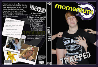
Developement of DVD Cover
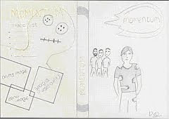 This is the plan for the DVD cover for Momentum, our concept for the cover involves the lead singer being grabbed by many female hands, we will have many females holding on to his body and I will then Photoshop the girl’s bodies out of the image to leave an array of female hands holding on to his body. We will try to co-ordinate, Dan, the lead singers outfit so it matches with the Momentum logo. As the logo features the colour purple, we will style Dan wearing a purple t-shirt, this will then be consistent. We will have the band in the background as I think it’s important to incorporate the whole band into the cover. The spine will be mainly influenced by Momentums logo, as when the DVD is on a shelf we would want it to be recognisable by just the spine. The spine will consist of the bands name in the style of the logo and also a slight image of the circled shape of the logo we think that this will make the spine stand out. For the back of the DVD cover we think it would a waste not to use the voodoo doll in the cover, we think this because as the voodoo doll is Momentums motif, its very recognisable so I’m planning designing the back of the DVD cover so the image of the Voodoo is the background, I will make the image very opaque so its not too obvious and also by making the image op
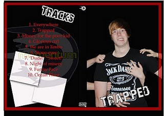 aque, it will lighten the bright yellow colour making it less dazzling and it will also allow the other images to be seen. Also on the black of the cover we will include the bands name at the top, the name will again be in the style of the logo to make it consistent. We will also include some images from the footage of the music video. We will have 3 images, one of the band, one of an instrument and another of the psycho ex-girlfriend (Georgia) who features in our music video. The images will be presented in a colour box format which will incorporate some colour into the cover. A track list will also be included on the back of the DVD cover.
Tuesday, 2 November 2010
Rough Cut Feedback
''This was an immensely enjoyable video and can be transformed into an excellent project. The narrative is very strong and Georgia's performance is magnificent. Abi’s performance is good too. The male lead is inconsistent in performance in the narrative and lacking power and charisma in the band footage. Remember, it is a magnificent performance of YOUR narrative, so the credit needs to go to you for producing the narrative. I do think most of it needs re-shooting, but you are able to re-shoot from a perspective of knowing that the video works, which is a good position.
General issues:
Lots of the footage is very dark
Lip synching is out
The violin footage jars with the overall video - perhaps this could be re-done with the band footage and the focus just on the violin, not the violinist.
The performance of the stabbing is a bit ropey.
The lead singer needs to be more dynamic.
It needs chorus shots with lots of energy.
I would have the cheeky wave on the last shot, before she becomes genuinely menacing and psychotic in the flick of a switch.
She needs to slap him harder. Could you use some diegetic sound for the slap?
How do you film a slap scene?
He needs to kick Abi harder.
When she has been dumped, but before she gets the doll she should "totally do one". She needs to be mental/devastated here. I want to think that suicide, crying and violence are all possible, before she settles on the doll.
The band need to be more dynamic.
DRUMS Drum shots on the drum solos. More band footage, but don't take too much of the narrative away because it is fabulous.
Get the brother out - I had to explain it to people who assumed it was just the protagonist.
Specific shots:
The walk on is nice but possibly a little slow. Remember the band are representing their whole brand image in the opening shots, yet we don't see their faces.
In the passage scene there is a banner on the door - this is distracting
The bedroom door is not the best
Why is Abi wearing that jumper on a date? Would he really ditch a girl who dresses as a nurse for one in that jumper?
Georgia too long outside the pub.
The wardrobe scene in edited quite awkwardly.
I like the head spin, but perhaps it needs to happen on the "Everywhere..." line to match the increased tempo of the song.
When he falls, which I love, it takes him a very long time (and shot more importantly) to get up.
Why does he have a T-shirt under his pre-surgery material?
Why is he about to open a wardrobe when he has just been in the pub?
On the first zoom on the doll you nearly miss the actual doll.
Suggested re-shooting:
Re-shoot the hospital scenes out of school.
Why does he look at the walls when the hood is removed? I would look at the person who took it off. Where was this scene filmed?
What is the time on the kitchen clocks?
More footage of the doll - it's really creepy.
Get a new barmaid.''
This is the feedback we received from our rough cut, we have thoroughly observed and taken in the feedback as we think that by considering suggestions of improvements to our video we can improve it and hopefully identify and complete changes that our target audience would enjoy and like.
It came to our attention that when we completed feedback, it was clearly pointed out to us that the slap scene at the start of the video, was too dark and more camera angles were needed to catch the mood and feeling of this key moment in the video. We took advice given in our feedback to re-shoot this scene using more and brighter lights and we also decided use two cameras’ to get more angles on the slap scene.
Through doing feedback, the feedback showed us that although our narrative is strong, our band performance lacks ‘charisma’ and ‘enthusiasm’ will have decided to improve this critiques made so we decided to offer our lead male techniques to improve his confidence. We think that this will improve the bands overall performance. We will also change the location of the band footage, by swapping a black studio for a small recording studio we think that it will add more character to the band footage and therefore create more charisma.
We were told that the violin footage didn’t relate as well as we’d hoped to the rest of the video so rather than incorporating a violin into the initial band we decided to cut the violin out as we didn’t think it would fit into a rock-pop band.
Thursday, 21 October 2010
Rough Cut Video
In this post you will find our Rough Cut video; by watching this you will see the links from our animatic and audience research, for example, the bed scene where the ex-girlfriend crawls up the bed - this was similar to our animatic video. We showed a group of people, who were our target audience (aged 16 upwards) meaning teenagers and young adults our rough cut video. They then returned feedback, which we used to help us improve our music video, to make it better suited to our target audience.
(We had to remove the song from the video to be able to post this on Blogger because of copyright reasons)
Wednesday, 20 October 2010
On Set Photos and Footage
Storyboard and Animatic Feedback
Animatic
The animatic was put together by placing the storyboards in order on Premier Elements. The song was then added so we could then change the length of each storyboard image and how long they lasted for e.g. one second or five second depending how long the audience need to see it. This means we will have a more clear idea on how long each shot should last when filming and editing, therefore letting us know how much more filming, narrative or band we would need. The animatic as a whole let us see what the music video might look like as the images go in time with the music and therefore show some of the editing techniques we may use. Due to this we got more of a sense of timing and speed as some shots were too long and this would bore the audience, although if they are too quick this would confuse the audience. As a result changing shots by using different storyboard images was key.
(We had to remove the song to be able to post this on the blog for copyright reasons)
Tuesday, 19 October 2010
Storyboards - Narrative + Band
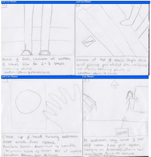
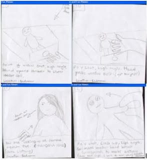
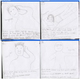
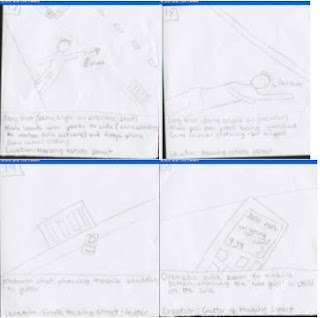
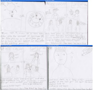
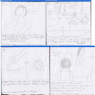
Below you can see the storyboards that we designed and used throughout the whole filming process, however, when we use the storyboards we may change our minds upon the situation of the scenes or the costumes worn by the actors etc. We stuck the storyboards to A3 bits of paper, and then laminated them so that we could take them to our filming shoots and they would not get ruined. When the storyboards were laminated we kept the narrative and band separate so that we weren’t going through all the sheets to find band yet they were still in order so the layout of the story wasn’t changed, it just made it easier to organise shooting. Therefore these were vital as it allowed us to discuss new ideas with each other while looking at our storyboard, filming and directoring. (As shown on bottom picture)By using the storyboards, it will help us while filming as it will support us with the organisation of shots, locations, Mise-en-scene and the protagonists needed for the scene. For example we know that when we film the falling scene that we need a phone as a prop and to do a range of close up and long shots to show the characters face and fall.
Narrative:
Codes and Conventions
After watching through various different pop punk music videos, codes that are used in the videos would be that the camera
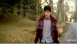 always uses a mid shot of the main artist, whilst performing, to show the audience who the main singer is, and who is providing the most powerful lyrics. Mostly the video is about the narrative/concept trying to be portrayed, usually this has a serious meaning, for example fall out boy’s – sugar were going down shows the hypocrisy of society by trying to show this though a light hearted way. http://www.youtube.com/watch?v=uhG-vLZrb-g
Usually if the speed of the song is sped up the editing and scenes of the video become faster to fit the pace of the video to fit in with the songs pace. Usually a punk pop video starts with a medium/slow
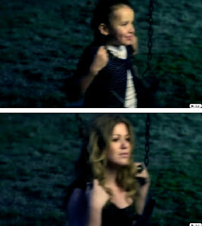 -paced mood, with the chorus becoming faster as the lyrics talk about the main message of the song. For example, in Kelly Clarksons video ‘my life would suck without you’ within this video, the edits/scenes start off slow, with a bit of background knowledge, then as the song becomes more fast paced, the cuts become faster and faster.
http://www.youtube.com/watch?v=WJedoEM7G5U
General observations from all punk pop videos show that the main costume/dress worn by the bands are usually darker colours for example; black, grey, red, blue. The usual clothing types are a casual t-shirt, with jeans and trainers, which suit the genre; in this case you could say the brands vans or converse. However the main singer of the band usually wears a lighter colour, this is used to make him/her stand out to the audience, again to represent that he/she is the most powerful. The use of clothing in the music video also reflect the mood of the song, so for example, if the song was about a relationship break up, the colours would be darker to represe
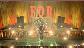 nt the melochany tone within the lyrics that is trying to be portrayed. Clothing would then be shown as for example; a hoody and darker coloured jeans, again trying to portray the depression within the song. When the band is playing their name is usually seen somewhere on the screen on that time also, usually either on the drum or behind the band, this is used to make the viewer subconsciously remember who the band is, and entice them into buying into the bands brand image. This can be seen in Fall Out Boy’s ‘thnks fr th mmrs’. http://www.youtube.com/watch?v=onzL0EM1pKY
Lighting within the video highly depends on what the video is trying to portray, again for example a break up, then the lighting would be darker, to represent the depressing tone within the video, as the narrative develops, the lighting would change, varying on what was happening with
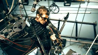 in the frame, if the band was performing the lighting will be focused on the band, with the lead vocalist being in the spot light, with the rest of the band positioned behind the lead, also being in light, but not spot lights. The props obviously if the band is performing will be their instruments, and then also anything else, for example the background – depending on what the background and foreground is it would vary. For example an arena, the background would possibly show some wiring that connect to the lights etc, where as the foreground would just be the microphones and stands and possibly any stands they may be on. http://www.youtube.com/watch?v=R8OOWcsFj0U
For example, in Muse’s ‘undisclosed desires’ the foreground does not vary greatly, and where as the background does, this contradicts the usual codes and conventions of a music video.
From the research we have gathered from this, we will be able to use these codes and conventions to our advantage in our music video. For example, when the song speeds up we will be able to make much quicker paced edits, to relate to the ‘craziness’ of the song.


